Over the past few years, the University’s acceptance rate has continually declined. It’s not hard to see why—a big bump in 2008 led to a fairly consistent increase in applications over time, with almost five thousand more applications received in 2017 than in 2007. Looking at the class profile published each year by the Office of Admission, this decreasing acceptance rate is one of the first things visiting students and parents are confronted with when applying to the University.
But receiving more applications doesn’t just mean a better rank in business publications. The Wesleyan Common Data Set (CDS), published each school year, reveals details about the racial, economic, and gender breakdowns of the University and how those demographics have changed as the acceptance rate has.
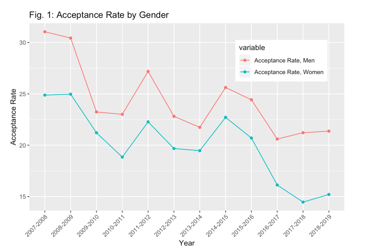
Looking closely at the data, one of the first things that jumps out is that this declining acceptance rate hasn’t affected all students in the same way. For instance, since 2014, it has gotten considerably more difficult for women to get into the University than men. Comparing acceptance rates over time, broken down by gender, the difference is stark—particularly for the most recent year available, which captures the 2018 admission cycle (Fig. 1). Note that the CDS does not track non-binary individuals.
Created by Features Editor Spencer Arnold
The gap here is a result of applicant imbalance. Significantly more women than men apply to the University every year, with a difference of close to 3,500 applicants at its biggest split in 2017. Over the past few years, the gender breakdown of applicants falls at about 60 percent women and 40 percent men. But according to the Office of Admission’s class profile, the actual percentage of women in each accepted class hovers between 54 and 56 percent, meaning the process is a lot more selective for women who apply.
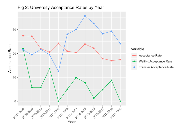
The “acceptance rate”, then, is not as cut and dry as a single number. The CDS reveals that this is also true for waitlisted students, whose acceptance rate (calculated here as the number of students offered admission out of those accepting a place on the University’s waitlist) has fluctuated from year to year, but a negative trend becomes apparent over the last decade or so (culminating with zero students from the class of 2022 getting accepted off the waitlist).
The acceptance rate trend for transfer students is a bit more complicated: it jumped to a height of 11 percentage points over the general acceptance rate in 2014, but since that peak it has been on a steady decline (Fig. 2).
Created by Features Editor Spencer Arnold
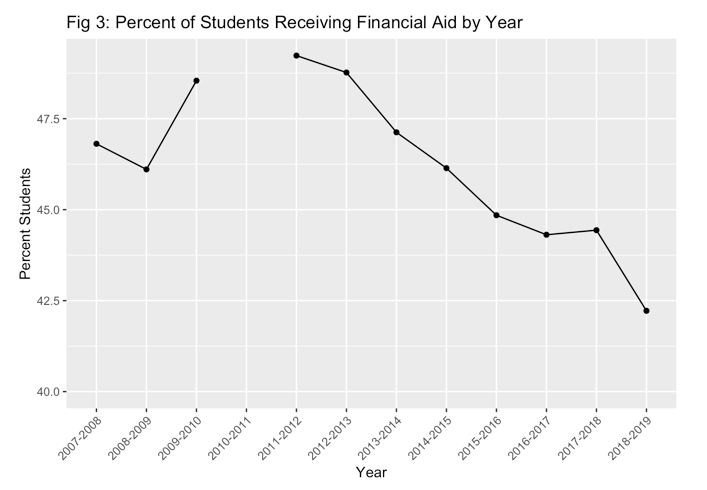
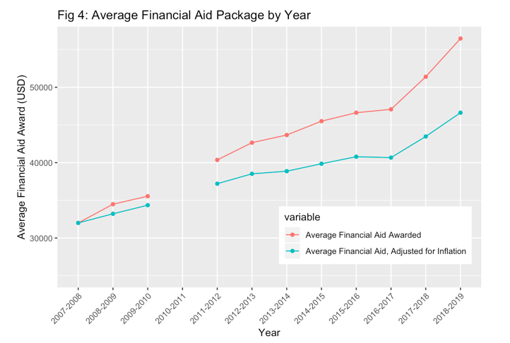
As each class has gotten more selective, the percentage of students receiving financial aid has decreased. This figure, which was just under half of the University’s population for the 2011–2012 school year decreased almost every subsequent year, dropping to 42.2 percent of students receiving any kind of aid for the 2018–2019 school year (Fig. 3). At the same time, the average aid awarded per student has only increased over time, even when adjusted for inflation (Fig. 4). Note that neither of these graphs include the 2010–2011 school year; a shift in how these numbers were reported left a one-year gap on the CDS. Additionally, following this gap, CDS financial aid figures are estimated based on fall enrollment—students who were abroad or otherwise off-campus in fall, but present in spring, are not reflected in the data.
Created by Features Editor Spencer Arnold
Created by Features Editor Spencer Arnold
These percentages do not match those in the Admission-published class profile, at least for the past few years. Since the 2015–2016 school year, there has been anywhere from a one to a five and a half percentage point gap between what the CDS reports and the percentage published on the class profile. Director of Institutional Research Michael Whitcomb, who works with the Office of Financial Aid to put together the CDS each year, explained this difference.
“[The financial aid figure] includes only those students who were first determined to have financial need and were then awarded aid,” Whitcomb wrote in an email to The Argus. “Thus, the CDS excludes students who did not have financial need but received some other form of non-need based aid (such as federal PLUS loans). This is why the CDS number is lower—it excludes a subset of financial aid recipients.”
The implication, then, is that as the gap between the CDS financial aid percentage and the Office of Admission financial aid percentage has increased, there are more students who are not qualified for University-sponsored aid seeking outside loans. But this does not mean that the overall percentage of students with loans has increased. According to the CDS, the total percentage of students with loans of any type has gone down each year since 2015, including any loans that the University is aware of. This, combined with the average size of financial aid packages increasing over time, suggests that while the University is accepting fewer students who need aid, the students who do need aid are receiving a fuller package that includes fewer loans. In essence, the CDS suggests that the University is taking more students with more need, rather than more students with any need.
This phenomenon—fewer students on aid, but more aid to those who qualify—is a reflection of a limited financial aid budget and demographic changes that are not exclusive to the University. President Michael Roth ’78 addressed this topic while speaking at a WSA meeting on March 3, 2019.
“It’s a big issue at all selective colleges and universities,” he said. “There are some that, until recently, had very few low-income students despite being very wealthy…. When schools like Wesleyan have tried to bring more first-gen, low-income students to campus—using community organizations or QuestBridge or other mechanisms—then you do have what you describe as the ‘barbell effect.’ You have very wealthy students and you have students who are from low-income families…. Because we increase the tuition to make the budget work, we have people who pay it without thinking very much about it, we have people who don’t pay it at all, and the real squeeze is on people who pay some of it because it’s hard to make those payments.”
The “squeeze” on middle-class families Roth identifies is the result of the University’s finite budget. With only so much money for financial aid, the University has to make a choice between accepting more students with less need or fewer students with more. With the adoption of a need-aware admission policy in 2012, the University is in a position to make that choice at the end of the admission process. Based on the CDS, it seems that the University has opted for fewer aid-requiring students that they can cover more fully.
On the other hand, since the 2012–2013 school year, the broad racial breakdown of the University has moved very little, particularly for domestic students of color. It’s a bit harder to tell with international students, as the CDS tracks “non-resident aliens” as a separate racial group and the Office of Admission includes international students as students of color in their published material, though these students come from a variety of countries and racial backgrounds. Here, international students are visualized separately from other racial groups (Fig. 5). Note that race is tracked based on self-identification, and that “Students of Color” include students identifying as “Black”, “Hispanic/Latino”, “American Indian/Alaska Native”, “Asian”, and “Two or More Races” (which wasn’t tracked until the 2010-2011 school year).
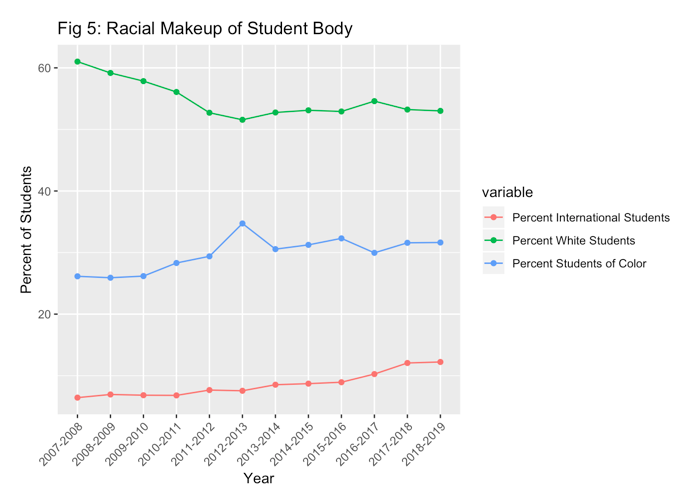
Created by Features Editor Spencer Arnold
Even more striking is how the proportion of each of these racial groups has remained stagnant over time. The percentage of Black students has stayed fairly consistent, while the Hispanic/Latinx population has grown and the percentage of Asian students has decreased fairly consistently (Fig. 6) The percent of Native American/Native Alaskan-identifying students is not pictured on the graph; it has hovered between one and two students on campus each year since 2010.

Created by Features Editor Spencer Arnold
Again, there’s a discrepancy between the figures published by the Office of Admission and those reflected in the CDS. Senior Assistant Director of Admission and Financial Aid Information Systems and Data Management Scott Houser provided an explanation for these differences in an email.
“[The] Admission’s Class Profile does count students in multiple categories if they indicated multiple races/ethnicity,” Houser wrote. “And those percentages include all matriculating students, including international students.”
Thus the chart above—which breaks down domestic students only, and counts multiracial students in their own category—provides context that the Office of Admission class profiles do not. But neither the CDS nor the class profile provide information about the racial makeup of applicants versus those who are actually admitted.
It’s an important caveat to keep in mind: This data isn’t complete, nor does it give a full view of how demographics are felt on this campus. But the data also illuminates the nuances that aren’t captured simply by the yearly publication of the University’s acceptance rate and demographic information—and helps better understand how this institution has changed over the last decade.
Spencer Arnold can be reached at sjarnold@wesleyan.edu.
Comments are closed