
Week Two of Studio Art Theses Showcases Prints, Pottery, and Pop Culture
The second installment of Art Studio theses was showcased at the Ezra and Cecile Zilkha Gallery this week, with an opening reception on Wednesday, April 3. A large audience of students, family members, and professors gathered eagerly to witness six captivating installations, each representing the culmination of a year-long journey, exploring and iterating in different mediums.
Attendees looked up in awe at monumental printmaking artworks, engaged closely with two painting installations, walked deliberately around a ceramics display, and immersed themselves in nature in a photography exhibition. After experiencing the excitement and fulfillment of the six artists during the opening ceremony, I met with them to delve into their goals, processes, and experiences while working on their projects.
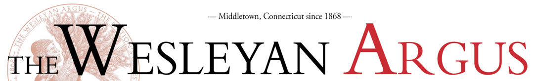
Finn Osborne ’24 showcased his collection of digital photographs in the South Gallery. Titled “Wissahickon Schist,” the exhibition drew its name from a type of rock quarried in a Philadelphia park that Osborne often visited.
“It is made of very thin sheets of crystals,” Osborne said. “When the light hits it at a particular angle, these sheets of crystals start shining in a way that is very difficult to capture in a photograph…. The space resonates personally for me because I’ve lived nearby and grown up going there a lot.”
While Osborne’s work portrays serene landscapes and natural settings, there’s a deeper layer of meaning behind his choice of subject. Osborne directly links natural environments with urban settings through his depiction of the rock.
“This rock was mined from quarries and the buildings in the city of Philadelphia are built out of it,” Osborne explained. “The Wissahickon is the name of a park that was founded to protect the Wissahickon Creek, a large source of water in the city. The founding of this place suggests the permeability between the city and the park, and so they need to protect the cleanliness of the water, right? But the runoff is still going through this place.”
As I navigated the area and delved into deeper discussions with Osborne, it became clear that his art explores the disparity between the idealism of untouched nature and the tangible impact of human activities on the environment.
“There’s a picture of a bird nest and, if you look closely, the bird was weaving the nest out of fishing line,” Osborne said. “So it’s an environmental thing, too, going on. There is a pervasive idea of this absolute control that is exerted over the natural world.”
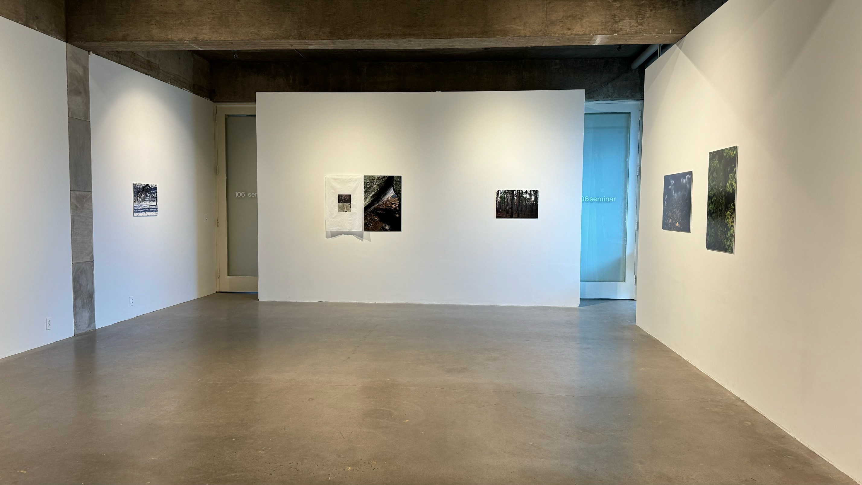
Next to Osborne’s exploration of nature and human intervention, Spencer Klink ’24 dove into the interplay of modern communication and navigating urban environments with his thesis. Klink’s monumental floor-to-ceiling printmaking installation spanned the walls and floors of bay one, the first space you encounter when entering the main hall of the Zilkha Gallery. It incorporated geometric arrangements of about 500 square tiles with differing colors, textures, and shapes that together formulated a modern language that inspired the title for his piece.
“I think emojis to me function almost as contemporary hieroglyphics,” Klink explained about his title, “🌈🏙️🚇😍 (Rainbow City Subway Love).” He spoke on the way that the exhibit took shape and his journey to get there.
“My process informed my understanding of my art as an abstract, graphic language, synthesizing my experiences traveling to New York and Berlin,” Klink said.
The diverse orientations of the individual units aimed to mimic the flow of activity in urban environments in an abstract manner. Tiles extending from different corners of the room in various paths and patterns, even spilling onto the floor, made entering the area a sensory experience. I was surrounded by vivid contrasts of lines and colors that created an optical illusion.
As I conversed with Klink, it dawned on me that the printmaking process itself infused meaning into the work, as he aimed to juxtapose a modern language with historical methods of communication.
“They’re printed on a machine called a vandercook, which is an old press used in publications proofing,” Klink said. “These motorized presses were originally used to proofread and publish newspapers before they were released to the public. So, my practice as a form of language and communication emerged from this machine’s prior function in different industrial times.”
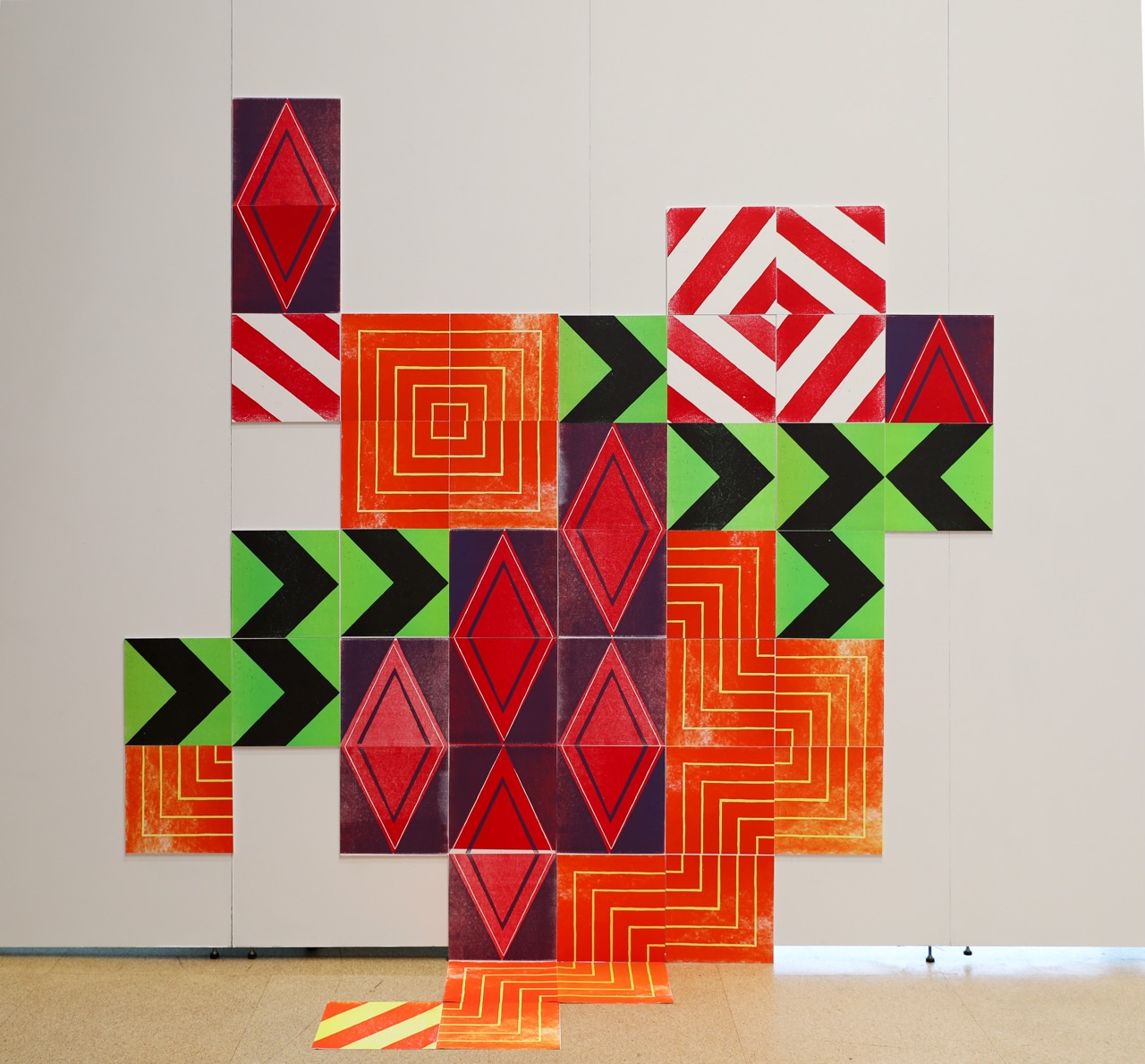
Before venturing further into the main hall of Zilkha, I felt drawn to continue down the hallway toward the north gallery, where a ceramics exhibition by Helen Townsend ’24 awaited me. This distinct space guided the viewer’s movement, leading them down a long hallway into an enclosed area.
“I liked the idea of leading someone down a path and into another world where it feels serene,” Townsend said, expressing how the space aligned with her artistic mission.
As I strolled through the tunnel, passing by two rows of repeating miniature warped ceramic cups suspended from yarn, I was undoubtedly transported into a magical realm. The hallway led me into a dimly lit room where spotlights created striking contrasts, accentuating all nine of Townsend’s mind-bending ceramic pieces collectively titled “Distortion, Unfired.”
“Everything in my exhibition is a wheel-thrown cylinder that is altered,” Townsend said. “I’d throw one thing on the wheel, let it distort a little bit and throw another…. I was trying to push them to the point of almost breaking without breaking.”
Upon observing the contortion of her pieces, it became evident to me that she had truly pushed the boundaries of her material. It was astounding to see forms that appeared twisted and bent yet maintained structural integrity. The sense of disorientation caused by the warping of the projects wasn’t just visual but also auditory, thanks to a video installation featuring Townsend deliberately dropping perfectly crafted pots.
“The video came later, and was in the same line of destruction and distortion,” Townsend said. “Especially if you’ve just started working with ceramics, you’re like, ‘This is so hard.’ So watching the pot die is like, ‘What the heck?’ That’s what hurt watching.”
Townsend observed that despite a piece being irreparably distorted, clay’s beauty lies in its ability to be recycled and adapted, as seen in the malleability of the form itself.
“When I messed up in the process of making, I let the clay dry out, added it to water, and then it basically disintegrates,” Townsend said. “Then I mixed it up, dried it out again, and then made new clay.”
The splattering sound resulting from the destruction of perfectly shaped clay drew the viewers’ attention not only to the final products but also to Townsend’s process, which sought to express the material’s pliability.
“I’ve worked in a community studio before, so I know how the process of recycling clay happens,” Townsend said. “That’s what’s so cool about clay. I could technically take everything that I made, drop it in a bucket of water, and make new clay.”
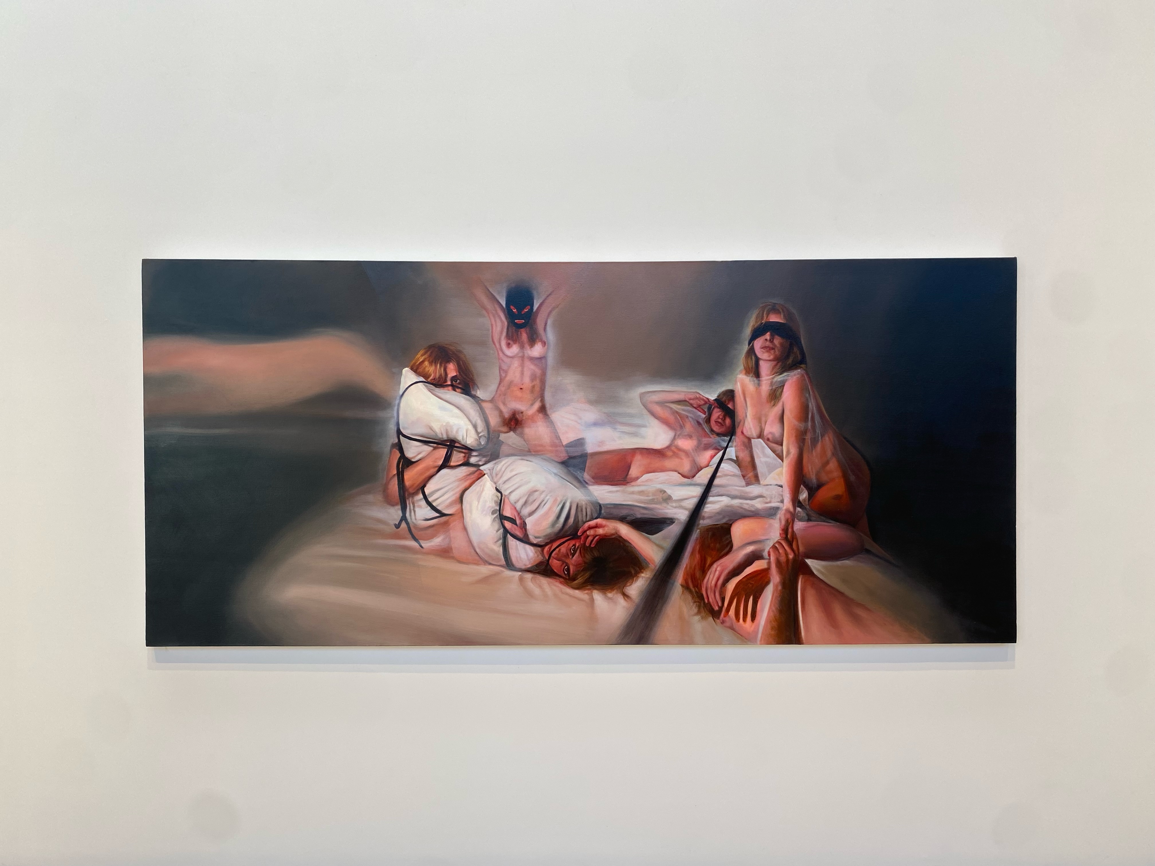
Upon returning to the main hall, I made my way to the second bay. Here, two paintings faced each other from opposite sides of the room, one depicting the artist, Bella Amenta ’24, in the nude, with blindfolds and rope around her hands, and the second painting depicting pillows similarly bound. At the center of the space, an assemblage of weaving rope and stacked pillows caught my attention. Nestled within the folds of the pillows were small close-up paintings of the nude body, creating a dialogue that connected the larger works together. The decision to position her work facing itself was carefully considered.
“Two big walls are facing each other, and they’re in conversation with each other,” Amenta said. “You’re encouraged to read them talking to each other. It changes what my work would mean versus if I put them just side by side. And then also having the space in the middle to construct a pillow sculpture means that, instead of just walking past my work, you can walk around and be more present in the space.”
Amenta drew inspiration for her exhibition, titled “Reparative Readings,” from an essay written by Eve Sedgwick, a source that profoundly impacted her journey of self-exploration through art.
“In choosing Reparative Reading, I thought about making this work a reparative process for me, like in my relationship with myself,” Amenta explained.
The essay prompted Amenta to delve deeper into the representation of ambiguity between the subjective notions of good and bad in her artwork.
“Even if something seems harmful or makes you feel uncomfortable…there’s also room to see beneficial things you can take away from it,” Amenta explained.“You don’t have to nullify a whole thing just because there’s one part of it you disagree with. And that’s what my work is about. It’s not about telling anyone exactly what to feel, but showing you something that lives in a gray area, in particular sex and pleasure, and also violence and pain. Typically they’re seen at other scales, but there’s actually a lot of gray area.”
Moving deeper into the main hall, I was drawn to an overhead sign carved out of wood and painted bearing the words “every 8 minutes, 24 hours a day,” signaling the start of a sensory onslaught. Alongside Klink’s installation, Kathy Liang ’24 presented a massive printmaking exhibit that covered the entirety of the third bay wall from floor to ceiling.
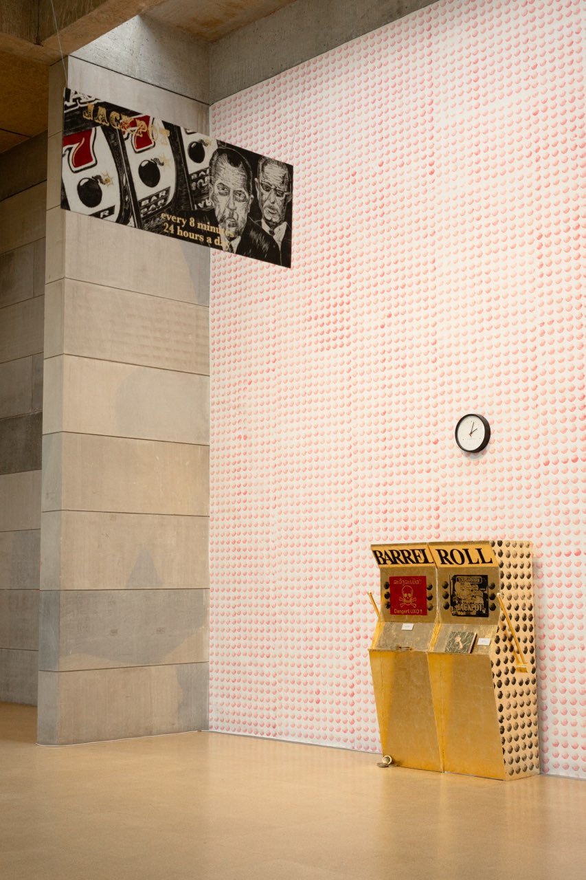
“My title is ‘JACKPOT’ because I wanted to get straight to the point, and to have it accessible enough so people can understand part of the theme but still have more to learn,” Liang said. “It was supposed to be a point of entry by drawing them in and experiencing my thesis as a little win, the definition of a jackpot.”
I was immediately struck by the repetition of small cluster bombs in vibrant pink color, and by two sculptural installations of slot machines colored entirely in gold with warning signs which read “Danger” and “Explosion.”
“The function of my thesis exhibition was to engulf its viewers into the colors, textures, sounds, and vibrancy of the materials I worked with through an initial over-saturation of visuals,” Liang said.
After immersing myself in the vibrant colors, I was drawn further into the narrative. I began to notice a contrast between the sensory appeal of the exhibit and the deeper, darker themes in Liang’s self-created books, which referenced historical references to war and imperialism.
“The viewer can unfold their way into the narrative I created in my artist books of lies, war, money, and resilience,” Liang said. “My book explains the Secret War in Laos, a bombing campaign led by the CIA, [which] my mother fled from as a child, and the imperialistic desires of the United States.”
Venturing deeper into the gallery, the rear chamber, lined with limestone walls, showcased six beautiful paintings by Coco Brooks ’24 in her show titled “Schadenfreude.”
“It’s a German term that refers to deriving pleasure from another person’s misfortune,” Brooks said. “My thesis explores an animosity towards American culture, coming from someone who was born here [and] has an insider’s view, while also feeling somewhat detached…. I lived in New York, then moved to England, and now I’m back for college.”
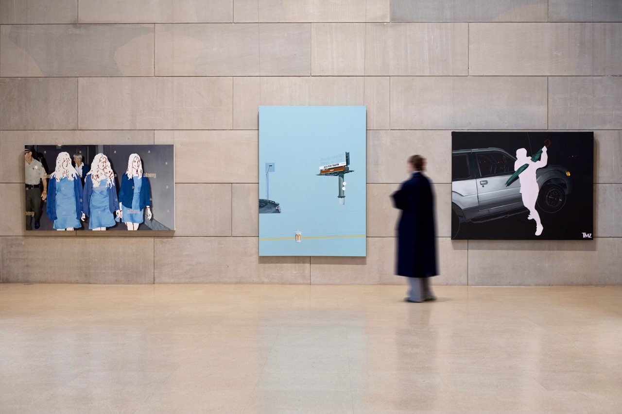
Brooks raised a series of inquiries during our interview regarding the purpose of her art.
“What does it mean to be a historically and culturally significant event, especially in the digital age?” Brooks asked. “How can you continue to use paint to address image ownership, censorship, and copyright?”
In addressing her questions, she employed oil paint—a traditionally prominent medium for recording historical events—to portray contemporary digital imagery featuring pop culture symbols such as advertisements, corporate logos, and renowned figures with obscured faces or bodies.
“I play around a lot with various forms of American extremism, like extreme fame and extreme religion,” Brooks remarked. “There’s a painting of Britney Spears attacking a paparazzi with an umbrella, a billboard depicting heaven or hell, McDonald’s cups, a strip club, a stove, pornographic advertisements, and the Manson family.”
Through various methods, she explored themes of censorship and copyright, primarily by blocking out the bodies of famous icons and depicting watermarks.
“Most of the people that I’ve painted have their identities concealed by being blocked out, partially because of anonymity or to refocus on the action, but also to think about personal autonomy,” Brooks said. “If a picture is taken of you, do you own the image?”
In the end, I departed from the gallery deeply moved by the stunning aesthetic choices and technical expertise evident in each of the six artists’ exhibitions and the hours of hard work poured into them. I was also struck by how each exhibit reflected the unique identities of the artists and aimed to delve into profound questions and deeper meanings they sought to explore through their artistic process.
The third week of studio art senior theses began on Wednesday, April 10, and the fourth week will begin on Tuesday, April 16. A reception for the artists is scheduled for Wednesday, April 17 from 4 p.m. to 6 p.m.
Dove Bonjean-Alpart can be reached at dbonjeanalpa@wesleyan.edu.
Leave a Reply