c/o wesleyan.edu
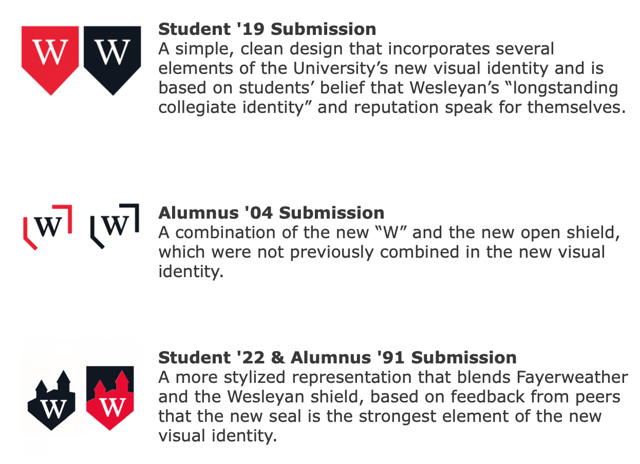
On Wednesday, Feb. 20, the three finalists for the competition to design the University’s new monogram were announced. Members of the Wesleyan community now have the opportunity to participate in an online vote to select the new monogram. Voting is open until Wednesday, Feb. 27 and the winning design is expected to be announced early next month.
Director of Marketing Deb Katz told The Argus that as of Thursday morning, over 3,000 votes had already been cast. However, she noted that it was difficult to determine which design was in the lead, as the results are constantly changing.
The University opted to use a design challenge and a community vote to select the monogram after facing intense backlash upon the release of a new monogram and re-designed website in September 2018, without consulting the Wesleyan community. Shortly after its release, that monogram was retired and the University returned to the former design.
“We’ve come to understand that the best way to develop a truly representative mark is to engage our community’s creativity and incorporate their feedback,” the Office of University Communications website reads.
These three finalists were selected from the submissions by a committee made up of a student, faculty, staff, and alumni. The committee was responsible for narrowing down the approximately 30 submissions from the Wesleyan community, as well as considering the submissions after seeing how the designs would look in low resolution, reduced in size, and on clothing. The committee took care in determining what other specific elements they valued in a new logo.
“I wouldn’t be excited by something that’s totally new-fangled and looks like it’s a clever new advertising logo,” said Professor of Economics and Chair of the Faculty Gilbert Skillman. “There’s a value to tradition and history in higher education.”
The members of the committee also expressed wide-ranging views about what they were looking for when it came to selecting the finalists.
“I’m not really looking for specific qualities that I like,” Aaron Cheung ’19, the only student to sit on the committee, said. “I’m looking for logos that express different ideas about, or concepts of, Wesleyan.”
Some members called into question the effectiveness of the process of selecting the finalists. Cheung noted that while he thinks there were interesting submissions, he would have appreciated having more designs to assess. Chief Marketing Officer of D’Addario & Co. Jonathan Turitz ’86 was also somewhat critical of the process.
“Ultimately, one person needs to make the call,” Turitz wrote in an email to The Argus. “You will never get 100% consensus on this. As for the design challenge, personally speaking, it would not be the way I would have approached the problem, but it’s Wesleyan, you know.”
Former President of The Hive Advertising Harold Sogard ’74 P’17 echoed some of Turitz and Cheung’s concerns, but ultimately concluded that this approach to designing a monogram was an improvement from the previous attempt.
“I have to admit, that in my advertising career I was a firm believer in the tenet that no really breakthrough idea can [ever] come out of a big committee or a public contest,” Sogard wrote. “That said, it is also important that the people whom a logo is meant to represent need to buy into it and feel proud wearing it. And that clearly did not happen with the first attempt at a new logo.”
Following the criticism the University Administration faced after the previous attempt to redesign the monogram, President Michael Roth ’78 emphasized that he was not part of the decision-making process this time around.
“I will not be looking at them myself, because there are enough smart people, and people who have strong opinions about the form of the W that I’d let them do their work,” Roth said.
Despite the University’s goal of receiving more input from the community, some students were still critical of the decision to put significant resources towards changing the monogram, especially when they felt that other issues on campus were more pressing.
“I feel like there are a ton of other places where these funds could be going,” Benny Soran ’21 said. “Given the current housing crisis, why can’t these funds be going towards repairs? It seems like Wesleyan is far more concerned with branding and public perception than issues that actually plague students while they’re at school.”
Leah Seldin ’21 was similarly frustrated with the decision.
“There was nothing wrong with the old monogram. This feels like a waste of energy, time, money, and resources. Everyone loves the current one because of the classic, collegiate style,” she said. “I’m failing to see how putting the W against a different outline is going to encourage students to apply [to Wesleyan] or enhance my college experience.”
Cheung suggested that the administration’s desire to change the monogram stems from alumni pressure, not from student concerns.
“There have been complaints from alums that Wesleyan doesn’t differentiate itself from other universities,” he said.
Despite this, many Wesleyan alumni also took to social media to express their frustration with the decision to change to monogram, as well as their dislike for the three proposed designs.
“Why are they all so bad,” Ethan Chupp ’18 commented on the University’s Facebook post announcing the community vote on the finalists.
When requested for comment, Chupp sent a follow-up message to The Argus.
“It’s unclear to me why they need a new logo, nor why they are prioritizing having a new logo over having a good logo,” Chupp wrote. “We’re an institution, we shouldn’t have a clever or gimmicky logo, but you can have something straightforward without looking like a free font sample.”
The voting page for the article will close on Feb. 27, and the link is available via The Wesleyan Connection.
Claire Isenegger can be reached at cisenegger@wesleyan.edu
-
Alumnus
-
I agree
-