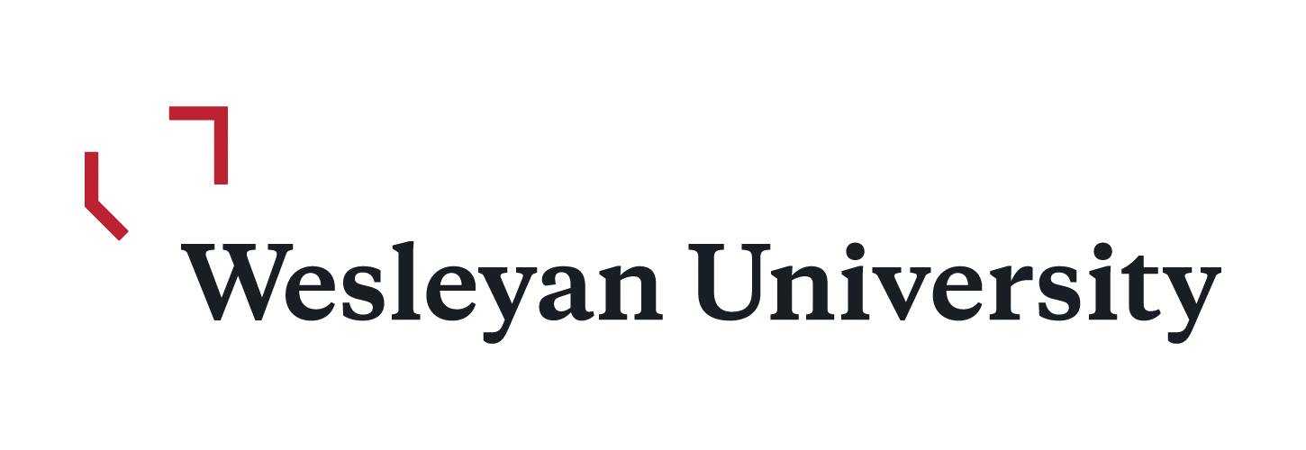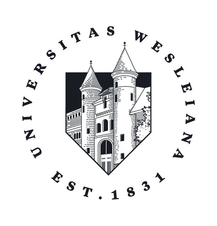
On Thursday, Sept. 20, the University website was updated and altered to include the University’s new logo.
The redesign is a product of the Communication Department’s two year-long Core Messaging project, during which it conducted extensive research to determine what students, faculty, and alumni appreciate about Wesleyan, and attempted to visually represent those values.
“A lot of people say they’d like to see the university tell its story more effectively,” President Michael Roth said in an interview with the Argus. “It’s not so much a logo, but it is a whole approach to how we provide images that represent Wesleyan.”
The project, which began in June of 2016, sought to examine how the University tells its story, both verbally and visually. The department worked with Lipman Hearne, a Chicago-based marketing and communications company, to complete the discovery portion of the project. They conducted surveys, focus groups, in-person interviews, and telephone interviews with thousands of prospective students, current students, faculty, staff, alumni, and parents.
“We were able to boil down all of that information really into five main pillars, five things that all those groups really believe when they thought about the Wesleyan experience,” Deb Katz, University Director of Marketing said in an interview with The Argus.
These tenets are the open curriculum, a willingness to learn and share knowledge outside the classroom, a preparedness for global leadership and change, meaningful faculty-student relationships, and lastly, a willingness to learn from and listen to one another. These pillars, Katz explained, are what makes Wesleyan special, and served as the inspiration for what would make its logo special as well.
“We handed that [data] to our creative firm, NAIL, and they actually brought everything to life,” Katz said. “They took all of the research and facts from all of those different groups and they came back with a new logo, new wordmark, new pieces”

There are three main visual components to the rebranding effort. The wordmark, which can be seen at the top of the University website, employs a traditional academic serif font to write Wesleyan, but the top left corner of the W is framed with a linear, open, red shield. They hoped this framing would serve as a modern interpretation of the traditional shield and highlight the values from the discovery portion of the project.
“We don’t want to leave tradition behind, but we do want to modernize,” Melissa Datre, University Director of Creative Services, said of the wordmark. “[We want to] better reflect what our student body is and represents, the openness, and really to highlight the traditional shield and modernizing it, breaking the boundaries in the ways that Wesleyan community members tend to do.”
The second component, referred to as the monogram, is essentially a shorthand version of the wordmark. Three angular lines make make up a W, which is framed on the bottom left and top right corner by the open shield, the same one used to frame the wordmark. The third mark that they are replacing is the academic seal. The rounded text that reads Universitas Wesleyana now surrounds a clean line drawing of Fayerweather and the towers, an image that is uniquely Wesleyan.
“The underpinning thing for the three marks is the simplicity,” Datre said. “It’s lines that are being used, and the colors we’re using for a modern age. Not only does it fit better for what the Wesleyan community is all about, but it makes it so we can use it in both analog and digital. It can be used in any medium now, where for some of the others it was hard to take that Wesleyan logo and make it look great anywhere.”
Dartre hopes that the new logos will add vibrancy to the University website, reflecting in turn the vibrancy of the Wesleyan community. The site’s redesign is mostly cosmetic, but they will be revamping the about page, the academic page, and the “Life at Wesleyan” page to include more stories on students, faculty, and alumni.
“It’s much more graphically interesting, using images, using angles, using hero photography,” Dartre said. “It’s very candid, and it’s capturing students, faculty, staff in those moments when they’re learning.”
Reactions to the University’s new visual representation have varied. Katz and Dartre say that admissions faculty have expressed excitement about the rebrand, and look forward to using the new materials in the admissions cycle to come. Jody Avirgan ’02—host of the FiveThirtyEight podcast and producer for FiveThirtyEight, ESPN 30 for 30, WNYC, and more—was unimpressed by the change. He expressed disappointment, but not surprise, that the University continues to trend more corporate and less eccentric.
“I’m a tad wary of this indicating a seemingly steady push towards Wesleyan positioning itself as another Cornell rather than the weirdo place I fell in love with,” Avirgan told The Argus. “That said, I was around when Wes had the idea to rebrand itself as ‘the independent Ivy’ which led to protests and op-eds and a quick retreat. So, part of me is heartened that the tradition of Wesleyan trying to be something that it’s not, and its students mercilessly mocking them for it, seems to be going strong.”

Many students have been doing just that. Dozens of memes have appeared on the Facebook group “Soggy We$ Memes,” mocking the new marks for being too tech-like, or too corporate, or for trying too hard. Within hours of the website going live, students banded together and organized to protest against the logo, which took place in Usdan at 7 pm on Thursday. Complaints, both official and unofficial, have been logged by the hundreds against the administrative change and campus is abuzz with talk of the rebrand.
In addition to all that, an online petition has been circulating on various social media platforms that both alumni and current students have been signing. As this article is being written, the petition currently has 1,206 signatures.
But Roth insists that with any major administrative change, resistance is to be expected.
“I hope people recognize it as kind of interesting and funny,” Roth said. “And some people will not like it, that’s the nature of these things. And if you say, ‘Oh some people don’t like it, we’re not going to do it,’ you’re going to have a cross with clams on it, that no one understands.”
Ultimately, the Communications Department is proud of the work that they’ve put into the project, and believe that the new marks effectively communicate why people love the University.
“It’s not only a visual identity,” Darte said. “It’s a voice.”
Sasha Linden-Cohen can be reached at srcohen@wesleyan.edu.


Leave a Reply