Matt Daniels Transforms the Journalism World
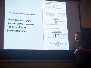
The innovative and now viral digital journalist Matt Daniels filled the biggest classroom in 41 Wyllys on Wednesday afternoon with students and professors who were eager to learn about how Daniels is revolutionizing journalism with the coding language of d3. Best known for his interactive graph that shows unique word usage of hip hop artists compared to Shakespeare and Herman Melville, Daniels is a graphic designer turned digital journalist and data scientist who came to Wesleyan as part of a lecture series sponsored by the University’s Digital and Computational Knowledge Initiative (DACKI) and Allbritton Center for the Study of Public Life.
History professor Gary Shaw, who is the associate editor of the Wesleyan-published journal “History and Theory,” noted that Daniels’ visit to campus was very relevant to some of the latest initiatives being introduced in the curriculum.
“The appeal of Matt Daniels was his working within some popular forms like rap music to illustrate the possibilities of digital and computational approaches,” Shaw wrote in an email to The Argus. “We have also been trying to develop a digital journalism course and Matt’s work allows members of the University to reflect further on that topic. We had brought Amanda Cox from the New York Times last year (as part of our programme) and this helped to deepen thinking about the issues—or so we hoped. In addition, this semester Wesleyan has launched its first Data Visualization course and how to make and understand visualization of data in a digital context is a crucial area to which Matt’s work contributes.”
Daniels’ lecture and presentation centered around esoteric coding theory that he was able to articulate in a way that was understandable and engaging for someone with little to no background in computer science or big data. In an interview after the presentation, Daniels described what he does to a layperson.
“I do data visualization, and instead of doing it for apps and startups and businesses, I’m doing it for content as media,” said Daniels.
Although you may have seen some of his work on websites ranging from Buzzfeed and Clickhole to The New York Times, Daniels is a freelance artist who publishes content on his website, Polygraph, that is then republished on other platforms.
“Everything is self published,” said Daniels. “I’ve been picked up by all of the media publications, but not with my consent. If you guys are familiar with the term republishing, I’ve had that. It’s just I haven’t written for a publication where my byline is on their website.”
In the Wesleyan community, Daniels’ interactive graph went viral on social media toward the end of the summer when it was first published, especially among hip hop and literary buffs. Although the graph is remarkably engaging and clear to understand, it was the product of an intense and lengthy process of data collection, coding, and experimenting.
“That was driven by a data set that I had on my computer looking at every hip hop lyric that was from a data dump by Rap Genius,” said Daniels. “I’d done a project with them earlier that year, the Etymology of Shorty in Hip Hop, which was a fun project. So I had this data set, and I was learning a natural language processing framework called NLTK, and in it they talk about measuring the vocabulary of a large body of texts. So, I figured it would be cool to marry this lyric data set with this approach for looking at vocabulary in large bodies of texts, and that was kind of the impetus for this idea, and then, slowly building what the story would be surrounding this idea and then publishing it on the internet.”
Daniels spoke for about half an hour, walking us through the nuts and bolts of his craft as well as the aesthetics of his digital journalism. When asked about his aesthetic choices and how they drive web traffic, especially since much of his talk centered around what readers will engage with the most, Daniels elaborated for The Argus.
“I think it’s just very much taste driven,” said Daniels. “So, instead of going off of ‘These are the dominant design patterns on the internet,’ it’s ‘Would people dig this design? Would they read it? Is it confusing? Are the colors good enough? Is it too big?’ So, I’m going off of my own taste profile, and then measuring that against what I think would get shared the most online.”
For many, Daniels is changing the landscape of journalism in the 21st century. For Daniels, however, it’s a much different and simpler story.
“I’m not changing anything,” said Daniels. “I’m just making cool stuff on the internet. And I think I’m looking [through] much more of a pop culture lens. There’s been a lot of data visualization done from various publications like The New York Times and Bloomberg specifically, that is incredibly amazing, and a lot of that is following the news cycle. So, since I’m not at a traditional news organization, I can kind of follow a similar process of similar ideas that aren’t necessarily ‘news worthy’ from a journalism perspective. So doing something on music, specifically like rapper vocabulary, isn’t necessarily tied to the news cycle but it is an interesting idea for the music community.”
When asked what advice he would give to an aspiring journalist or coder, Daniels reflected for a moment.
“One, definitely learn d3,” he said. “And then, come up with an idea that you really wanna explore. So, if you’re curious about a certain trend in sports or politics, or music, just try to find a good approximation for that idea with data, and then try to build something that you think your friends would share on the internet. It doesn’t have to be amazing, it just has to fit your own test of whether it’s cool or not. So if you think it’s cool, predominantly your friends will [too]. So just experiment and make, and don’t worry about whether it would pass the test of The New York Times or if it would get published somewhere professionally. It’s all your personal project on the internet. The only person that will really care is your parents and yourself.”





Leave a Reply