Anyone with a semblance of contact to the art world has probably heard the recent hype about the “Picasso Sculpture” exhibit at the Museum of Modern Art in New York. In a particularly glowing review, The New York Times called the exhibit a work of art in and of itself. So, in the midst of my preparation for an art history exam last weekend, I took a study break to take in this eclectic mix of works, which happened to be the very same art I was studying.
No matter how you look at it, Cubism is about depth. Its works portray various angles of one image simultaneously. Its paintings use shading and mottling to intensify and flatten depth in different areas. And its constructions challenge notions of depth by utilizing space to suggest figure. So, when it comes to sculpture – the form of art that explores depth in the most literal and explicit way – Cubism’s playfulness and experimentation come to life most strongly. Throughout the exhibit, the space allows audiences to circumambulate almost all of the pieces, providing the opportunity to take in every angle of these complex, varied works.
“Picasso Sculpture” functions as a sort of flashback – the introduction is written in the same room that the circuit ends, a large space flooded with light and filled with life-size, painted sheet metal pieces from the end of Picasso’s career, so you start at the final years of Picasso’s sculpture and then move all the way back in time. The next room (technically the first full room of the exhibit), is dated 1902-1909 and showcases Picasso’s first sculpture, “Head of a Woman,” as well as early Cubist works and his African and Oceanic-influenced wood carvings.
The next few rooms swing fully into Cubism, an umbrella under which Picasso explored depth, resulting in his especially well known “Guitar” construction (MoMA was able to procure both the construction-paper model and the final sheet metal version), and also began to utilize a huge variety of materials. The sculptures function almost like collages, each a medley of texture, size, and angles. Larger sheet metal sculptures utilize space to make dense metal appear lightweight and pliable, seemingly floating in space. Picasso constantly undermines the physical qualities of the materials he employs, removing them from their everyday use and refashioning them into graceful, artistic, and often playful forms.
A few shallow boxes hanging on the wall displaying folded paper, patterns, and wooden blocks, bring to life another essential element of Picasso’s work – newsprint. An integral method by which he engaged with modernity and media, newsprint appears throughout his paintings and sculptures, appearing more prevalently toward the beginning of the exhibit and usually in smaller, more intricate works. Newspaper clippings also played a significant role in the way Picasso punned and played with his audience: The letters of a heading, “JOU,” which famously appear in his painting “Still Life with Chair Caning,” also turn up in one of these sculptures. “JOU” is presumably the beginning of the French word for newspaper, “journal,” (they are portrayed in the font commonly used by newspapers at the time), but the letters are ambiguous – they also spell out the beginning of “jouer,” the word for “to play.”
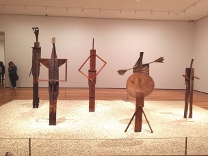
At a certain point, which isn’t quite announced by a specific room but rather appears as a slow trend throughout the second half of the exhibit, Picasso’s work becomes significantly less delicate, heavier and denser than it previously was. Around the 1930s, he produced a series of decidedly phallic white plaster busts, suspected to depict his lover at the time, Marie-Thérèse Walter. He also starts to incorporate even more “found” objects – in addition to salvaged sheet metal, he employs tennis balls for eyes and wicker baskets for ribs. In the second-to-last room, he assembles less industrial and more home-oriented objects into spindly, human-like figures, created during a period that corresponded with his move to a villa in a residential neighborhood, and his newfound status as a family man inform the lean of the sculptures themselves towards domestic content. Some are in action – one girl jumps rope, and an alien-like man pushes a lawnmower – and others, like the five arranged in a closed-off rectangle of pebbled floor, simply stand, echoing the shape and form of humans but not quite depicting actual people. This latter collection is called “Bathers” and happens to be the only multi-figured sculptural ensemble that Picasso ever produced.
Audiences leave this wood-dominated room and walk through the fourth floor of MoMA to return to the exhibit’s opening room, where a theatrical finale is housed in a room overlooking the courtyard. Here, we see a culmination of various aspects Picasso had played with throughout his career. He treats sheet metal like paper, assembling pieces together, painting on them, and bending and layering them. They all hold vaguely human–or, at the least, animal–forms, yet deny the specific qualities of any identifiable creatures.
The MoMA exhibit captured Picasso’s inability to be captured. It showcases his refusal to fit into a certain art movement, as well as his works’ tendency to hover between painting and sculpture. While some works have patterns or even faces painted onto their surfaces, others consist of mere objects but lie somewhat flat against a wall.
Picasso was frustratingly inconsistent, rebounding from style to style, taking long breaks and then producing an explosion of sculptural work, and his sculptures hold such a vivacity that many appear barely willing to remain in the forms into which he’s welded them. The exhibit handled Picasso’s mayhem like a patient parent handles an irrational child. It was organized in a way that didn’t attempt to restrictively categorize any of Picasso’s work, yet still suggested a streamlined succession of time. It highlighted his creativity while compromising for the confusion of his madness. It gave audiences a peek into Picasso’s chaotically creative, incessantly in flux, mish-mash of a mind.


Leave a Reply